Thursday, May 10, 2012

First few sketches


I also have these first few sketches from the beginning of the semester.
The top one is "organic subject matter" So I sketched a cicada shell I have. However, I pushed it too far to the top and bottom of the page.
The middle one is "people in a public place" I sketched these people in the Applied Tech building donating blood. I was on the second floor looking down on them.
The last picture is my portrait of Tom Cruise as a cowboy. I took a scene from "The Last Samurai", and froze it at this moment, and thought it would make a great portrait. I should have spent more time on it, but I thought the idea was a good one.  I go the idea to take a movie still from

Past work

Here is some past work from the beginning of this semester.


This was the first assignment of the semester. The project was "Back in the Day". The idea was to show what old school arcades felt like to the kids who frequented them. I originally wanted to do a video game machine at first, but the composition just wouldn't work out, so I went with a pinball machine. My inspiration came from Frank Frazetta, Boris Vallejo, and Julie Belle.

final illustration


Here is the final illustration!
I feel that I was successful in pulling off the main idea of the painting, however I feel that I needed at least 100 more hours on this piece.


The above pictures are as following:
TOP: my color sketch for this painting. I put several color swatches together, and tried to see how each color would interact with each other.
Next down: My value rough for this painting. I didn't finish it, because it fifulled it's purpose even though it was unfinished.
Above bottom: This was my initial sketch for the painting. I did it with a 2h pencil, so it's pretty light.
BOTTOM: This is my first comprehensive sketch. My comprehensive sketches were done mostly in line, because I was painting over it anyways, and since I had my rough sketch to guide me through most of the values, so I did a really light comprehensive sketch right on the illustration board.

Sorry for the spots on the picture, my camera's lens needs to be cleaned.

Tuesday, May 1, 2012

Sketch and final project

So, this is my sketch for Opposites. I took inspiration from Yin and Yang ( real original) and tried to do things that were opposite. So I did a forest goddess and cybernetic creatures. I wanted the forest goddess to be kind, so she is "embracing" the cyber creatures, while they are much more aggressive, linking with the trees around her, and downloading data and stuff like that. This was based off of a sketch I had done earlier in life. The material that the robots are made of is similar to the clear material on the robots from the movie I robot, except they are black.


This is also the sketch that I am using for my final project
Some inspiration: from Wangrongrong


H.R. Giger
I robot

weekly sketches

This is my sketch for distill an article or book into a picture. I chose The Dragonsong books by Anne Mccaffrey ( i apologize for any misspelling). This picture is of the main character with the firelizards after she has seen them for the first time. She plays a song that she made up on the spot for the queen firelizard, and she plays the song on a flute she made herself out of a reed.

more sketches

Here are the sketches for our theme assignment. I sketched out two ideas, Urban Space Cowboy, and Aliens Eating Babies. So, the first picture is of my ideas for the aliens eating babies idea. I wanted to do the alien concepts first, so that I could have an idea of what they were before I made the painting. I used it as practice for being a concept artist. The idea behind the aliens was that their whole life cycle would be based around catching babies and storing them in the sac-like stomaches. Then, they could either incubate the babies, making new aliens out of them, or they could digest them. I also thought that babies could refer to women, since baby is a form of endearment. I thought that would be more ethical, anyways.
The second sketch is my character design for the urban space cowboy. I had this idea that the world he lived in would be like Firefly, in the fact that westerns would be blended with Asian language and culture. So I had this crazy idea that he would have a cybernetic arm, which was gifted to him by the Japanese. He would also have a samurai shoulder guard on that arm. I forgot what the characters mean, but the basic idea was that they were describing him as a lone wolf sort of character, who had a troubled past. I wanted the gun to be unique as well, and I have some concepts for that that I might post later.

These are the thumbnail sketches. I was playing around with different compositions and stories.
Settled on this sketch
Then sketched out some concepts for the outlaw robot. I wanted to be sure that it retained the western feel, so I integrated the hat, chaps, and my favorite addition, the giant cigar. THe idea behind that was that there was a respirator that the hat hid, and the respirator took the cigar smoke and pumped it directly into a mask the outlaw wore, so that he only breathed cigar smoke.
This is the rough sketch. I painted it to get the values roughed in quickly. I apologize for my shadow being in the picture.

Thursday, April 19, 2012

new weekly sketch

This sketch was anthropomorphic portrait, and I did a tiger general. I could have pushed the value a little darker, and moved the general's badges up away from the bottom of the page. Overall, I think that this was a moderately successful picture. the picture was a little cropped, but nothing important was taken away, just a little of his sleeve was removed.

illustraton comprehensive sketch

Did this sketch in conte crayon on toned paper. The basic idea was to try out the process demonstrated by Donato Giancola in his tutorial "The Mechanic". The basic idea was to take your comprehensive sketch and mount it directly to the board with matt medium. I thought that this sketch came out well. Finally figured out the anatomy on the figure, and instead of the city idea, or towers, I put in an army, which helped get the idea a crossed, with out drawing too much attention away from the main figure. I added the swords because the other students mentioned that it was weird that the warrior was entering a room that wasn't very dangerous looking. So the sword idea came from Jon Foster's illustration of the dog and boy leaping over a pit of spears, and the LDS painting of Captain Moroni and Title of Liberty.

Friday, March 16, 2012

New Art Tutorials!!!!!!! My life is now over until further notice!!

Just got some of the concept art .org downloads, since they are having a SALE!!!!! All downloads are $6.99, so I finally got the $60 5 hour long tutorial about digital art I've wanted!!! I also got a 5 hour long tutorial by Donato, and one by Dan dos Santos along with several others. Excitement permeates the air..............

Tuesday, March 13, 2012

the madness continues......

Here's the next step towards the final illustration. I was only supposed to use 4 values on this, and I think I was moderately successful. Going for a graphic, Frank Frazetta-esque look. Might add parts of futuristic armor, or cyborg parts to him, just to tie the fantasy and science fiction elements together a bit. Gonna have to play around with how best to emphasize him, since I feel that he isn't quite as strong a focal point as I want him. Well, gotta keep working!


This is the latest weekly sketch. The theme was something mechanical, and I originally thought of doing a transformer, or something steampunk. Then, my dad suggested I do a drawing of a fighter jet, since one of the artists I've been following, Feng Zhu, gave the students at his school the assignment to draw some fighter jets, and those turned out spectacularly. This sketch tuned out to be NOTHING to their level, but it was a good exercise in perspective. Just gotta watch my values, composition, and have a cooler idea for next challenge which is........ something moving. Hmm..... an acrobatic quickening fair that's been genetically mutated with a musk ox? Gonna have to think about that one. 

Thursday, March 8, 2012

Sketches and Ideas


 I did this first sketch for the weekly sketch challenges. The theme was something inorganic. The reference was a movie still from the movie "Avatar". I wanted my inorganic object to be a modern, "concept art" like object. My first idea was to do some transformers, but as I don't have that movie, I decided to go with the movie Avatar, for convenience. I did this sketch in pen, having been inspired by a fellow classmate, and the artist Feng Zhu. At first I was intimidated by pen, because of the permanency of it. One wrong mark would ruin the picture, right? But after I saw my classmate's picture, I realized that you simply drew over the mistake, and it really didn't show. So I tried this sketch and found, to my amazement, that it was turing out well! I liked how much darker the values could get, and how bold the overall picture became. However, I didn't take into consideration the perspective of the drawing.

 These sketches were for the new assignment we got this week. For this assignment, we are supposed to illustrate the word Resilience. I would imagine the "client" wants it done for some sort of card game, or motivational poster. So, I sketched out a few ideas.
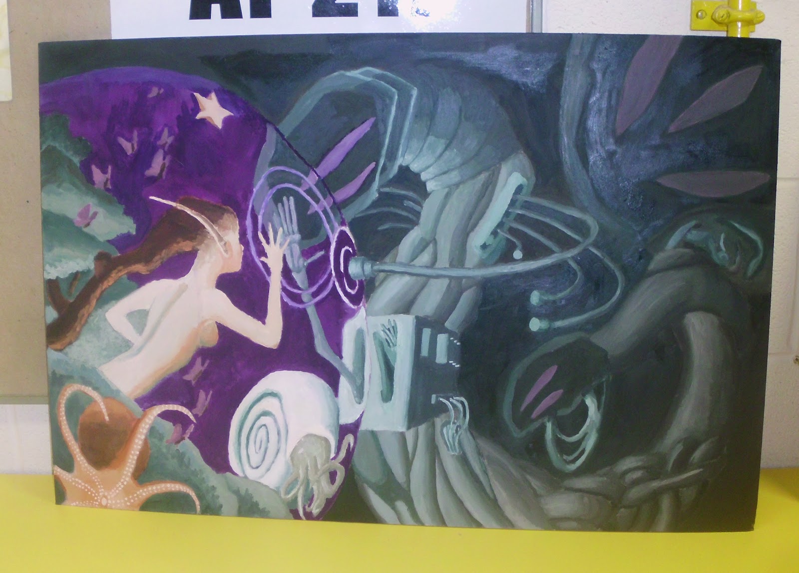
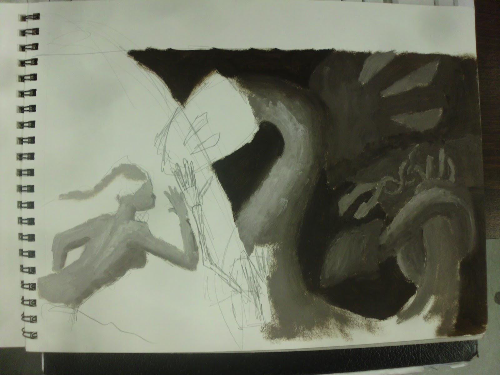
             To give a little background info, the last illustration I did came out pretty bad, in my opinion. The composition was great, but I felt that the rendering was not up to scratch. This time, I am going for a simpler composition and subject matter, so that I can have more time to render the subject well, and have less smaller subjects to render. I'm pretty sure this will help my piece. I'm aiming to make my illustration look professional, and when I say professional, I'm thinking something like Boris Vallejo, Julie Bell, or Frank Frazetta. This might be aiming a little high, but we'll see how it goes!

 
And so, we come to where I am right now. I chose this idea, since it had interesting subject matter, and had a simple design, with one, large figure to render. It also had some interesting design elements to it, with the arrows sticking out of the figure's body. The basic idea behind this painting is that this warrior shows resilience through his actions. He has taken a lot of punishment, but is still fighting. My inspirations were warriors like Boromir from LOTR, who took 3 arrows, and was still fighting,  and the samurai from The Last Samurai, some of whom took 7 or 8 bullets, and were still fighting strong. That was the basic idea. So, I made this warrior leaning on a door jam or pillar (haven't decided yet), clutching his sword, which he is barely holding up. I want to put a look of grim determination on his face, and the background will be a battleground with ruined buildings, and perhaps an atomic explosion in the background, make it all scary-like and apocalyptic.

Wednesday, February 29, 2012